

Holocaust Center For Humanity
AEO & SEO (Search & Answer Engine Optimization)
Brand Refresh
Content Strategy
Custom Software Integrations
Design System Architecture
Email Campaigns & E-newsletters
Information Architecture (IA)
UX/UI (User Experience, User Interface)
User Flow
User Journey Mapping
Web Development
Website Audit
Website Design
Website Strategy
The Challenge: A Nonprofit Website Hiding A Powerful Story
After nearly 18 years, the Holocaust Center for Humanity had outgrown its website. Two decades of research, programs, and expertise had accumulated faster than the site could organize it, leaving a deep library of content waiting on a structure and a user journey worth rebuilding around it. Educators planning field trips, students doing research, donors ready to give, and families hoping to visit were struggling to find what they came for. The result was a website that no longer worked as hard as the mission required.
The bigger problem was what visitors couldn’t see. Survivor voices, local history, and a mission built around action were buried under layers of pages, so the site wasn’t telling the Center’s most powerful story. Behind the scenes, staff were working around disconnected tools, turning every website update into a long, complicated project. The Center needed more than a redesign. It needed a platform that could carry its powerful story through images and content, serve every audience, meet accessibility standards, and grow with the organization.
The Solution: Strategy, Storytelling And Accessible Design
Strategy Built On Real Data
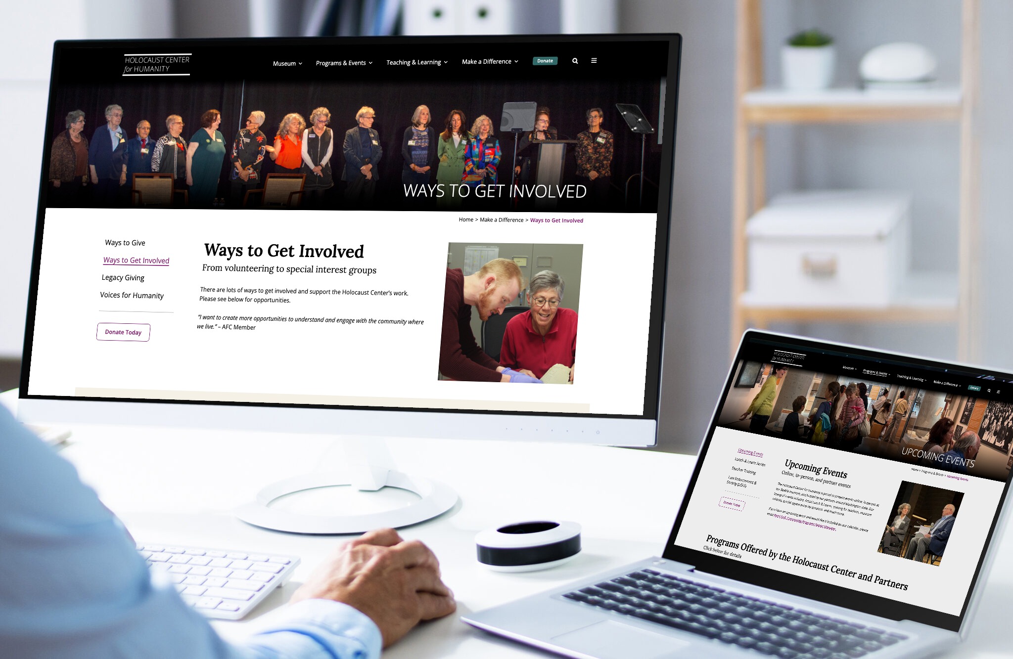
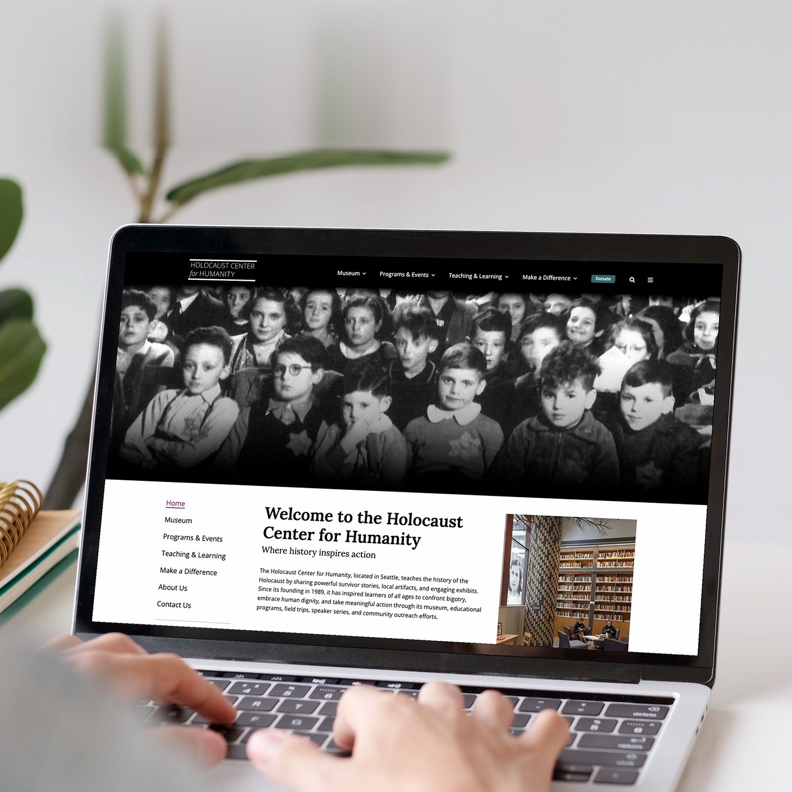
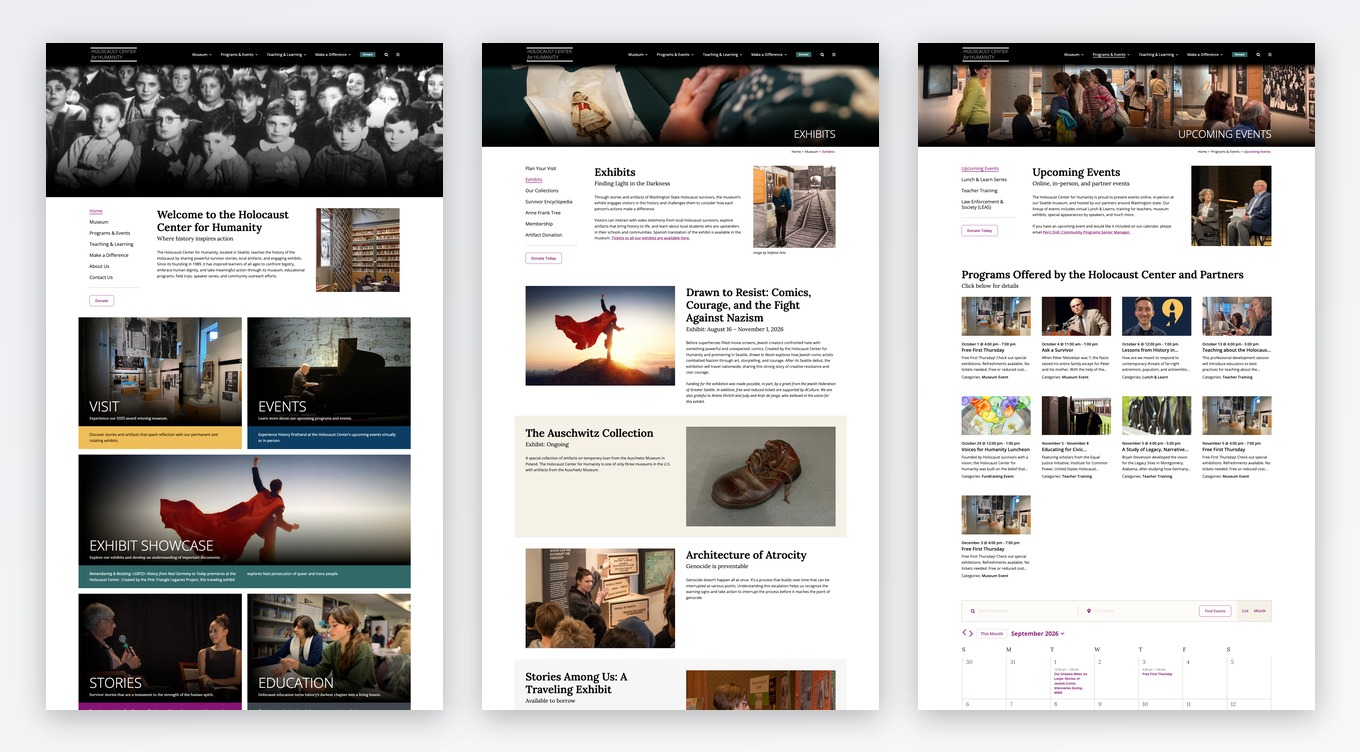
Jennergy started with a full website audit, using real visitor data to cut redundant and outdated content. Working closely with the Center’s team, we rebuilt the information architecture, mapped each audience’s journey, and organized the site around five clear pathways: Museum, Programs & Events, Teaching & Learning, Make a Difference, and Donate. Every visitor now has a direct route to what matters most to them.
Storytelling At The Center
The site was rebuilt from the ground up, and storytelling guided every decision. Survivor testimony, artifacts, and the Center’s mission now lead the experience, paired with powerful imagery, a new type system, and space that lets each story breathe. Content carries visitors from learning to action. Homepage story tiles give several ways in, so a first-time guest and a returning educator each find a natural starting point.
A Dynamic, Modular Design System
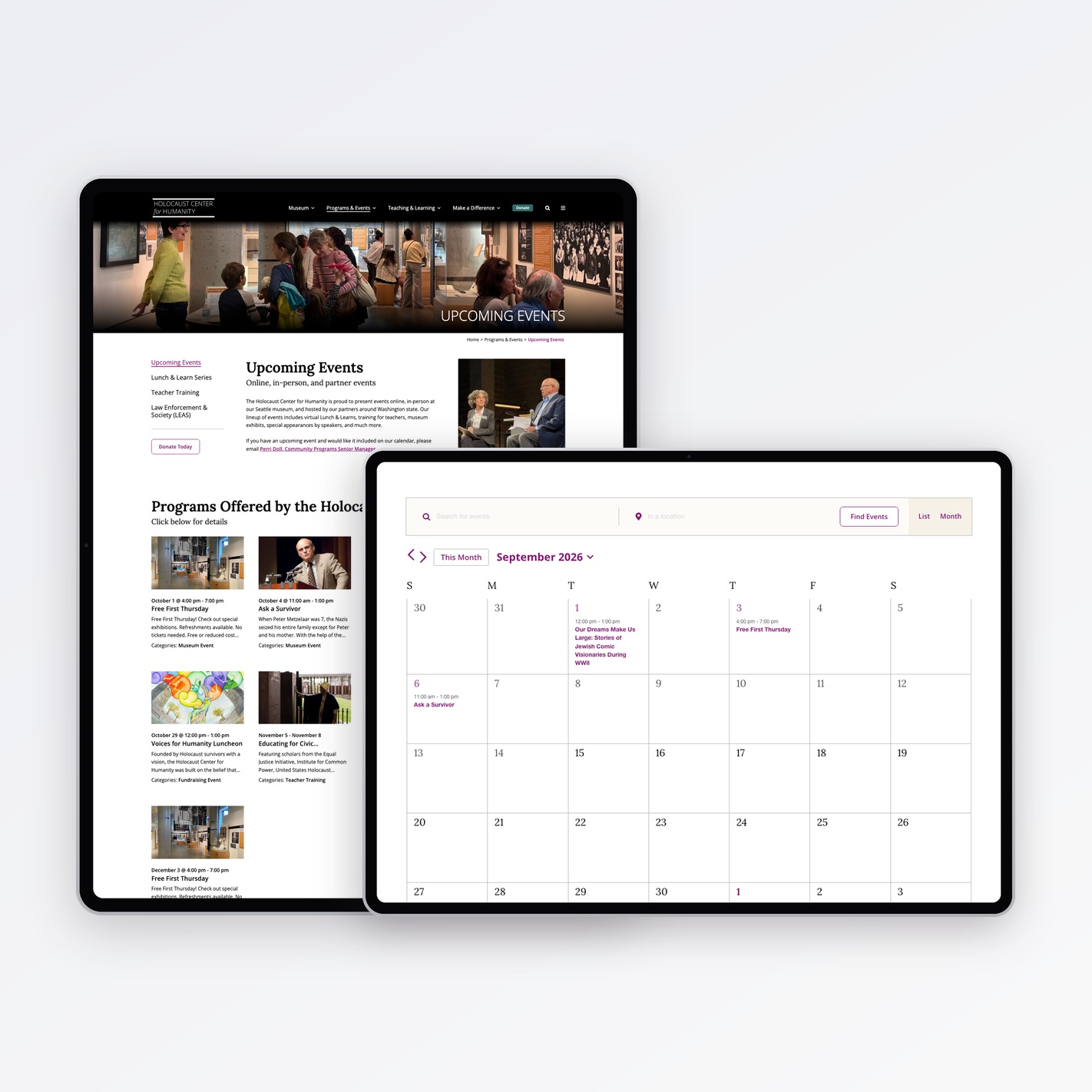
One system, many stories. Jennergy built a component library that keeps every page consistent while giving the Center room to tell exhibits, events, virtual programs, and educational resources their own shape. New content never means a new design. Every component is fully responsive, maintaining the integrity of the experience across devices, from a phone in a classroom to a desktop at home.
Integrations That Work Behind The Scenes
A great website has to run smoothly for the people managing it. Our team built a custom events calendar around how the Center’s team actually works, so they can publish and update programs in minutes. We also integrated the Center’s existing platforms, unifying previously scattered tools into a single connected system. Visitors now follow a continuous path from program discovery to registration, and from reading a survivor’s story to making a gift.
Accessibility By Design
Accessibility was a first principle, not a final checklist. WCAG and ADA standards shaped the work from the first wireframe through final development, covering color contrast, keyboard navigation, screen reader support, and clear content structure. The same structure that serves assistive technology serves discovery. Clear heading hierarchy, descriptive link text, and semantic markup make the site readable to screen readers and to the systems that increasingly answer questions on the Center’s behalf, including Google’s AI Overviews and AI assistants.
A Brand That Travels
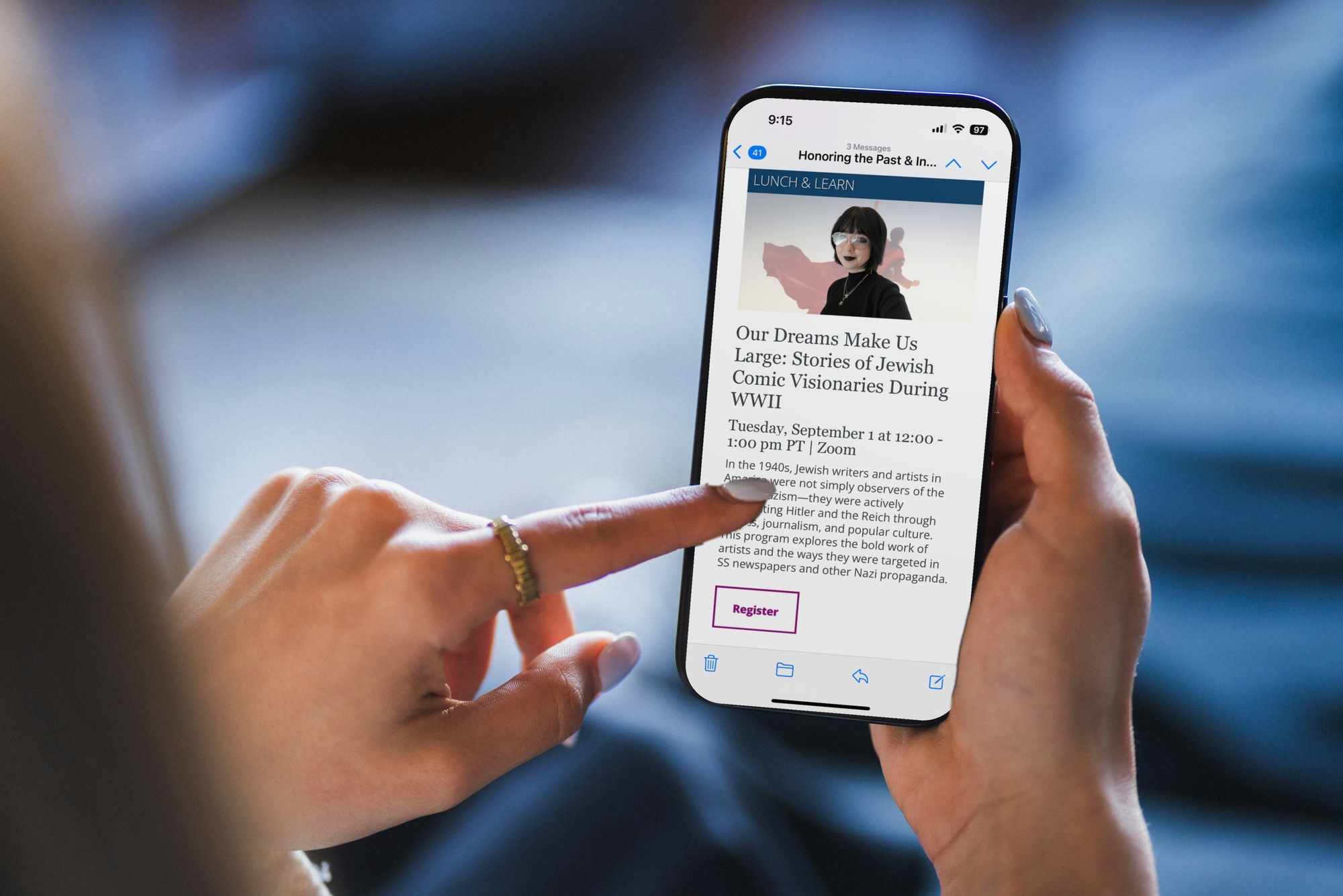
The website brand refresh was designed to serve the Center’s audiences across every channel, not the website alone. The system translates consistently into print and digital applications, from exhibit materials and educational resources to fundraising and event communications. The idea was to accommodate future touchpoints as the organization grows. Jennergy also designed a branded email template system in Neon, the Center’s existing email platform, for newsletters, event invitations, and donor campaigns. The Center now has one identity, carried consistently across their marketing channels.
Built To Be Found
Great content only matters if people can find it. We optimized the site for SEO and structured every page so Google, AI Overviews and LLM-based search tools can read, understand and surface the Center’s programs, exhibits, and educational resources. That drives traffic today and helps its story reach new audiences for years to come.
A Team Powered To Grow
Flexible WordPress templates and hands-on training mean the Center’s staff can create pages, publish events and update content on their own, without waiting on a developer.
The Result: A Website As Meaningful As Its Mission.
The Holocaust Center for Humanity now has a website as meaningful as its mission. Educators find resources in a few clicks, families plan museum visits with ease, and donors have a clear path to give. The refreshed brand looks and sounds consistent across every touchpoint, from website to email. The Center’s team now manages content independently, without developer support, and the site’s reach continues to grow across Google, AI Overviews, and AI-driven search.
Considering A Refresh?
If your organization is weighing a digital transformation of its own, we share what the process actually looked like from the first audit to launch, and how a small staff stayed in control of it on our blog. Read the full story.
Jennergy partners with organizations ready to rethink how their mission shows up in the world. If a brand refresh or website redesign is ahead of you, we would welcome the conversation.
Working with Jennergy over the past 18 months has been an outstanding experience. They guided us through the complete rethinking, redesign, and rebuild of our website, transforming nearly 18 years of accumulated content into a clean, modern, intuitive site with clear messaging, a cohesive user experience, and a strong visual identity. From the beginning, their team took the time to understand our organization, our audiences, and our goals. They were incredibly knowledgeable, patient, and thoughtful, walking us through every step of what was a complex project with professionalism and care. What felt overwhelming at the start became a collaborative and well-managed process because of their expertise. The result is a website that not only looks beautiful but communicates who we are far more effectively and serves our visitors in a meaningful way. After completing the website, Jennergy continued to partner with us on brand design and messaging, and we look forward to continuing that relationship. I recommend Jennergy without hesitation to any organization looking for a first-class team that delivers both an exceptional process and an exceptional final product.
- Ilana Cone Kennedy, Holocaust Center for Humanity