Seafair 2022 Campaign
Branding
Brochure
Concept Development
Custom Icons, Illustrations & Infographics
Digital Marketing
Marketing Materials
Posters
Print Marketing Materials
Social Media Ads
Branding a festival for multiple marketing platforms with a thoughtful creative strategy.

Even fun projects are not without challenges.
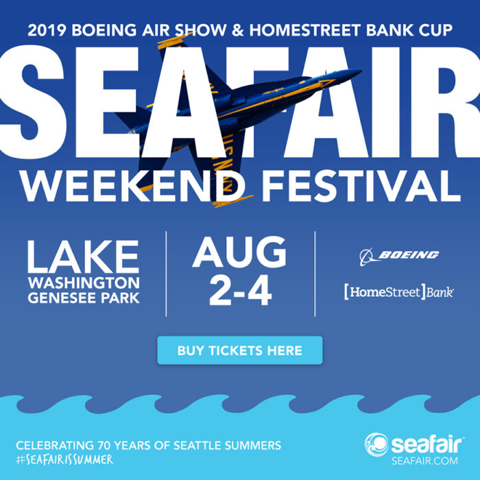
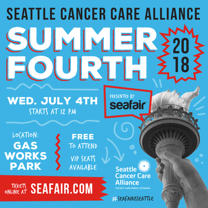
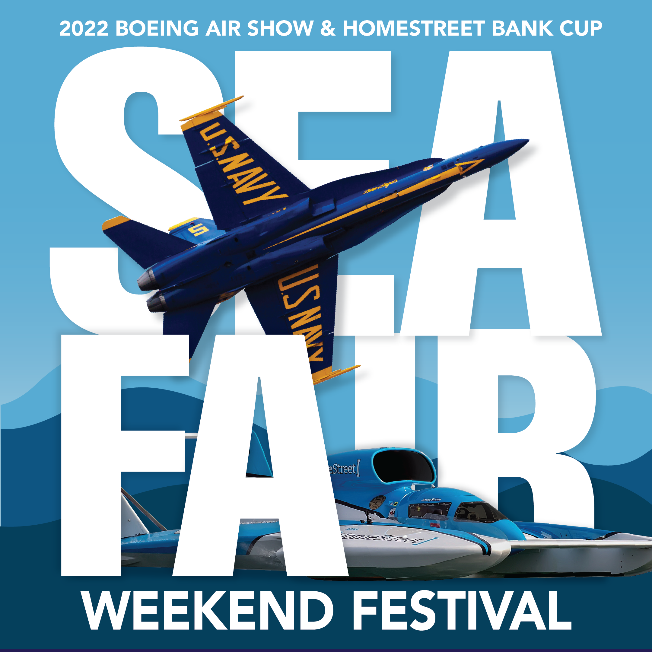
Although we have the experience of working with Seafair for five years, each year brings the challenge of giving the event series its own look. The signature events need to not only look different from past years, but also as their own unique events. The brand colors are are carefully chosen so they can look like their own event, while also looking good as a collection of events together. Readability is largely important to ensure the event name is readable with the incorporation of recognizable graphics related to the event. We also consider the consistent placement of the event dates and locations, while still making sure to showcase the sponsors. Hierarchy plays a big part in the success of the readability of the event information, proper placement of primary and secondary sponsor logos, and the Seafair brand.


Creating a unified campaign with uniquely branded events.
We worked to create a unified campaign with uniquely branded events. Seafair is a collection of events, all leading up to one main event to showcase summer. Each event has a different appeal, often with an entirely different demographic. While the Triathlon appeals to the athletic, the Torchlight Parade offers families a memorable experience. The Summer Fourth celebration is enjoyed by families, groups across generations, and the wider Seattle community. The design of these events needs to not only speak to these various demographics but also work together as a whole. Whether you attend one event or multiple, the design must have a cohesive appearance to communicate being under the larger Seafair umbrella of events.
Events with multi-generational appeal.
The Seafair Festival Events have a multi-generational appeal. From a nationally-ranked fireworks show to a 8k evening fun-run, to a showcase of the world-famous Blue Angels—Seafair has it all. Having something for everyone means the event promotion has to have a broad appeal. The use of vibrant colors, vivid imagery, and bold typography all help to communicate one thing: fun. The Seafair 2022 campaign brightened up the typically grey Seattle to highlight every local’s favorite time of year—after all: #SeafairIsSummer!

Jennergy was like finding the perfect date to the hottest event in town when we were looking to update our festival branding. We wanted to look younger, fresher and their team really listened to our vision and direction and gave us great pieces to work from. Jennergy had amazing execution and helped keep us on a strict timeline during a 50+ event season as well as providing great options to help keep us within our budget.
- Patrick Harrison, Seafair